Sego

Conworlds and conlangs
bradrn
Posts: 5612
Joined: Fri Oct 19, 2018 1:25 am

Re: Sego

Post by bradrn »

Richard W wrote: Fri Nov 10, 2023 11:32 pm
bradrn wrote: Fri Nov 10, 2023 5:33 pm
sasasha wrote: Fri Nov 10, 2023 8:40 am Does anyone know how one would make a font for this, btw? I don't know how syllabic fonts work (and have never created a font).
The first step is to think about the encoding and whether you want it to work with Window applications. Fortunately (unless you use certain styles of Sanskrit), text on Microsoft Edge is now rendered as though it were not a Windows applications. Unless things have improved recently, for Windows you may have to use a previously encoded script (a 'hack' encoding), whereas puristically you should the Private Use Area (PUA), which is typically lacking in support for graphic ligatures with the Windows rendering. For HarfBuzz applications, unless things have degraded, one can have ligaturing between points in the PUA.
Oh, I don’t think this is Windows-specific. There’s all sorts of special cases with this stuff. Not to mention font hinting…
Whether you encode it as a syllabary or an alphasyllabary (compare the Cree syllabary) is up to you. It's not an abugida. It may be simpler to encode it as an alphabet if you plan to use programs to modify text. Now, you may choose to treat the circle used for some of the long(?) diphthongs as a separate character, but if you don't, a font for a PUA encoding would work with Windows applications.
Linguistically speaking this is an abugida, though that has no particular relevance for encoding.
Conlangs: Scratchpad | Texts | antilanguage
Software: See http://bradrn.com/projects.html
Other: Ergativity for Novices

(Why does phpBB not let me add >5 links here?)
User avatar
WeepingElf
Posts: 1345
Joined: Sun Jul 15, 2018 12:39 pm
Location: Braunschweig, Germany
Contact:

Re: Eusebaze

Post by WeepingElf »

sasasha wrote: Fri Nov 10, 2023 8:57 pm From 283 FE the Seguweans used an extended syllabary (/abugida) renamed Eusebaze (‘parade of creatures’).

Here it is.

Image

The warm colours show the original set. Cool = the extensions. The two lilac columns, for -i and -o, are used to write other languages (especially Lantha), and the several dialects which can helpfully make use of them.

Below: the word ‘Eusebaze’ as on a chalk-board. I haven’t decided yet whether I love or hate the incongruousness of the shark glyph.

Image
Wow! That script looks amazing and drop-dead gorgeous!
... brought to you by the Weeping Elf
My conlang pages
sasasha
Posts: 434
Joined: Mon Aug 06, 2018 11:41 am

Re: Sego

Post by sasasha »

bradrn wrote: Fri Nov 10, 2023 11:45 pm
Richard W wrote: Fri Nov 10, 2023 11:32 pm
bradrn wrote: Fri Nov 10, 2023 5:33 pm
The first step is to think about the encoding and whether you want it to work with Window applications. Fortunately (unless you use certain styles of Sanskrit), text on Microsoft Edge is now rendered as though it were not a Windows applications. Unless things have improved recently, for Windows you may have to use a previously encoded script (a 'hack' encoding), whereas puristically you should the Private Use Area (PUA), which is typically lacking in support for graphic ligatures with the Windows rendering. For HarfBuzz applications, unless things have degraded, one can have ligaturing between points in the PUA.
Oh, I don’t think this is Windows-specific. There’s all sorts of special cases with this stuff. Not to mention font hinting…
Thank you both. So, as I understand it, whilst it's not ideal puristically to use a pre-existing code-block like that for Ge'ez or Devanagari, you both think it would be preferable if I did? Given that I'm conpletely unlikely to need to use a Seguwean font to write in either of those scripts.
bradrn wrote: Fri Nov 10, 2023 5:33 pm
Richard W wrote: Fri Nov 10, 2023 11:32 pm Whether you encode it as a syllabary or an alphasyllabary (compare the Cree syllabary) is up to you. It's not an abugida. It may be simpler to encode it as an alphabet if you plan to use programs to modify text. Now, you may choose to treat the circle used for some of the long(?) diphthongs as a separate character, but if you don't, a font for a PUA encoding would work with Windows applications.
Linguistically speaking this is an abugida, though that has no particular relevance for encoding.
Ok, I would be quite interested to try to put the question of classifying this system (abugida, syllabary, alphabet) to bed actually, as it's bugging me.

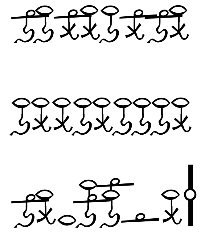
Let's start with the old set, Methakhe-kēu. This was in concept a syllabic system, just in terms of what info was being encoded in each glyph. The only diphthongs in the classical language were /æ͜ɪ/ /ɑ͜ʊ/, represented by ⟨ae⟩ ⟨au⟩, so including the long vowels, each vowel segment had its own ‘body’. One might call it an abugida - except that the consonant segments are clearly not prime, with relatively insignificant adaptations per vowel; if anything, the vowel segments are graphically dominant. One could refer to it as an alphabet or an alphabetic syllabary, like Hangeul.

However, this vowel system was pretty mangled by the time of the Eusebaze reform. Some other VV sequences had diphthongised, some of those diphthongs had monophthongised, and some segments (notably /e/) had devoiced and all but disappeared, leaving a trail of palatalisation, spirantisation and clustering in their wake... And dialectal and register variation was high.

The reformers left actual sound alone; whilst even the Emperor's speech wasn't going to match the clean logic of Eusebaze, that wasn't the point. In fact, syllables were no longer the point. Whilst ⟨kēu⟩ might be heard in Makemura as /cɨː͡ʉ/, in Kemudaru as /çœː/, and in Lesuše as /'ki.lu/ ‒ i.e. with varying weights/moraic structures ‒ there would still be just one ‘body’ used.

Once decoupled from the concept of the syllable, the scribes extended this trait beyond its original utility: now any sequence which had been VV in the classical language, including those that crossed morphemic boundaries, might be written with the appropriate single ‘body’. This had been occasional with ⟨ae au⟩ pre-reform, in shorthand; but the reformers wanted to (a) rebrand the administration with the slightly ostentatious new glyphs, e.g. the shark glyph, (b) make official-style writing slightly less accessible to the rising merchant classes, and (c) to make their own jobs (writing) quicker/more compact, regardless of the cost for those parsing their texts.

To use one of my previous examples (on the drive), ‘inhabitant of Usage’ is ‘Usage-upu-e’ in the classical language. Pre-reform you would write it as such, with separate glyphs for ⟨ge u pu e⟩, which handily makes each morpheme begin with its own glyph. Post-reform you would write it ⟨u sa geu pue⟩, with two morpheme boundaries embedded inside a ‘diphthong’ glyph. (Non-imperial officials continued to write how they wished, of course, but writing in the Eusebaze style became a marker of prestige.)

The point is, it became a mixed system which could be ‘sub-syllabic’ like Devanagari (where vowel segments had been lost, and syllable codas thus began to take their own glyphs), syllabic, or ‘super-syllabic’ (where adjoining vowel segments were compiled into one glyph). The possibility of combining ⟨-a⟩ glyphs into vertically-stacked sequences of up to 3 syllables (which, in terms of encoding, theoretically adds another 8,000 glyphs to the set :shock: ) further erodes the notion that this is a ‘syllabary’.

I think then ultimately it sort of isn't an abugida or syllabary post-reform. Maybe it's truly an alphabet, with compulsory ligatures on a roughly syllabic scale; but it's disingenuous to describe e.g. the shark glyph as a ligature of ⟨e u⟩ as it has nothing, graphically, in common with either. So I'm still stumped ‒ not that it matters much!

In terms of consequences for encoding – I don't know. I'm grateful for all the pointers re this and sure it will become a bit clearer as I try to do it, but a lot of what you've both said has gone over my head; does anyone know of a ‘make a font (maybe with ligatures)’ guide for absolute noobs?

Thanks again both!
Last edited by sasasha on Sat Nov 11, 2023 6:52 am, edited 3 times in total.
sasasha
Posts: 434
Joined: Mon Aug 06, 2018 11:41 am

Re: Eusebaze

Post by sasasha »

WeepingElf wrote: Sat Nov 11, 2023 6:01 am Wow! That script looks amazing and drop-dead gorgeous!
Thank you so much! Much appreciated :D
bradrn
Posts: 5612
Joined: Fri Oct 19, 2018 1:25 am

Re: Sego

Post by bradrn »

sasasha wrote: Sat Nov 11, 2023 6:32 am
bradrn wrote: Fri Nov 10, 2023 11:45 pm
Richard W wrote: Fri Nov 10, 2023 11:32 pm
The first step is to think about the encoding and whether you want it to work with Window applications. Fortunately (unless you use certain styles of Sanskrit), text on Microsoft Edge is now rendered as though it were not a Windows applications. Unless things have improved recently, for Windows you may have to use a previously encoded script (a 'hack' encoding), whereas puristically you should the Private Use Area (PUA), which is typically lacking in support for graphic ligatures with the Windows rendering. For HarfBuzz applications, unless things have degraded, one can have ligaturing between points in the PUA.
Oh, I don’t think this is Windows-specific. There’s all sorts of special cases with this stuff. Not to mention font hinting…
Thank you both. So, as I understand it, whilst it's not ideal puristically to use a pre-existing code-block like that for Ge'ez or Devanagari, you both think it would be preferable if I did? Given that I'm conpletely unlikely to need to use a Seguwean font to write in either of those scripts.
Yes, that would probably be preferable.
One might call it an abugida - except that the consonant segments are clearly not prime, with relatively insignificant adaptations per vowel; if anything, the vowel segments are graphically dominant. One could refer to it as an alphabet or an alphabetic syllabary, like Hangeul.
Or some kind of ‘flipped abugida’, like Pahawh Hmong! (Though that one’s sufficiently weird it doesn’t even have a specific, ‘official’ term.)
The point is, it became a mixed system which could be ‘sub-syllabic’ like Devanagari (where vowel segments had been lost, and syllable codas thus began to take their own glyphs), syllabic, or ‘super-syllabic’ (where adjoining vowel segments were compiled into one glyph). The possibility of combining ⟨-a⟩ glyphs into vertically-stacked sequences of up to 3 syllables (which, in terms of encoding, theoretically adds another 8,000 glyphs to the set :shock: ) further erodes the notion that this is a ‘syllabary’.

I think then ultimately it sort of isn't an abugida or syllabary post-reform. Maybe it's truly an alphabet, with compulsory ligatures on a roughly syllabic scale; but it's disingenuous to describe e.g. the shark glyph as a ligature of ⟨e u⟩ as it has nothing, graphically, in common with either. So I'm still stumped ‒ not that it matters much!
Devanagari is still called an abugida, even though a bunch of syllables in Hindi have lost the inherent vowel along the way from Sanskrit. For that matter, we still call Tibetan an abugida, even though many glyphs have always represented single consonants, and any trace of phonemicity has gotten utterly mangled over 1000 years of evolution. So ‘abugida’ is probably the best name, in that it’s flexible enough to refer to a bunch of different conventions.
In terms of consequences for encoding – I don't know. I'm grateful for all the pointers re this and sure it will become a bit clearer as I try to do it, but a lot of what you've both said has gone over my head; does anyone know of a ‘make a font (maybe with ligatures)’ guide for absolute noobs
The FontForge guide I linked earlier is probably the closest you’re going to get.
Conlangs: Scratchpad | Texts | antilanguage
Software: See http://bradrn.com/projects.html
Other: Ergativity for Novices

(Why does phpBB not let me add >5 links here?)
Richard W
Posts: 1398
Joined: Sat Aug 11, 2018 12:53 pm

Re: Sego

Post by Richard W »

bradrn wrote: Fri Nov 10, 2023 11:45 pm Oh, I don’t think this is Windows-specific. There’s all sorts of special cases with this stuff. Not to mention font hinting…
Unfortunately, it is, or was in Windows 7 days. I remember putting together the rebellious (by rectlinearity) font Da Lekh for the Tai Tham script and totally failing to get the glyphs for individual characters to interact (by ligaturing or other substitutions) in plain text in Windows (Uniscribe or DirectWrite), while I could get them to interact in HarfBuzz. Does the Windows rendering stack now invoke any features by default for the PUA?

Technical note: In OpenType, a feature is a set of rules for glyph substitution or positioning for the transforms (by CMAP) of a sequence of characters in the same script, language and overall direction. (This concept of direction ignores local variation as characters get minor rearrangements as in many Indic scripts. In turn, the existence of rearrangment depends on the encoding as well as the writing system, so the original, mostly phonetic order, of encoding of New Tai Lue had it, but the newer, visual order encoding doesn't. ) Each script and language has its own set of features, but fortunately there is the concept of 'other' (technical term: 'default') languages.

Font hinting is almost orthogonal. There are two main favours of glyph definition with 'hints' - True type, which uses quadratic splines and (shape adjustment) instructions and Adobe (the correct term escapes me) which uses 'separation hints' (the true term escapes me), which are reported to be supported poorly on Windows. One can also define OpenType glyphs using SVG directly - I don't know what non-Windows platforms they're supported on.

There are three aspects to using Sego fonts:

1) Character encoding
2) Glyph combination
3) Glyph definition

Character encoding and glyph combination interact in terms of what rendering system they are compatible with, and potentially also automatic font selection, where I think Windows is probably the least friendly system. The tasks can be addressed separately. For example, in the the Hosken font creation team, Debbie designs the glyphs (item 3), Martin does the 'programming' (item 2) and also contributes to the ISO process of character encoding (item 1).

In my font creation system, I can treat all three separately. As I haven't worked out how to do fine feature definition with AFDKO, I use my own font compiler, which limits my ability to help others.
Richard W
Posts: 1398
Joined: Sat Aug 11, 2018 12:53 pm

Re: Sego

Post by Richard W »

bradrn wrote: Fri Nov 10, 2023 11:45 pm Linguistically speaking this is an abugida, though that has no particular relevance for encoding.
What's the implicit vowel then? In terms of Daniels' classification, it seems actually to be an alphabet! However, that statement feels a bit odd, rather like saying modern Lao, Mongolian in Phags Pa or Arabic script Kurdish is an alphabet. (All these systems have only explicit vowels.)

There is one encoding/keyboarding issue, though. There is an issue with distinguishing the stack <pa> from the sequence <p><a>, which for all we've been told, might occur at a morpheme- or word-boundary. When typing hieroglyphs with my keyboard, I type a hyphen to force the start of a new hieroglyph, and for an alphabetic encoding, we could use ZWNJ (U+200C ZERO WIDTH NON-JOINER) to suppress ligation. For an abugida, we would want a virama or a vowel killer to do the separation job.
Last edited by Richard W on Sat Nov 11, 2023 9:55 am, edited 1 time in total.
Richard W
Posts: 1398
Joined: Sat Aug 11, 2018 12:53 pm

Re: Sego

Post by Richard W »

sasasha wrote: Sat Nov 11, 2023 6:32 am I think then ultimately it sort of isn't an abugida or syllabary post-reform. Maybe it's truly an alphabet, with compulsory ligatures on a roughly syllabic scale; but it's disingenuous to describe e.g. the shark glyph as a ligature of ⟨e u⟩ as it has nothing, graphically, in common with either. So I'm still stumped ‒ not that it matters much!
It still makes sense as an alphasyllabary - one just treats the vowel sequences as further vowels. That is a potential problem with a hack encoding - 20 vowels is a lot. But, Tai alphasyllabaries may stretch to 25 purely vocalic options /a ɛ e i ɔ o u ɤ ɯ aː ɛː eː iː ɔː oː uː ɤː ɯː ia ɯa ua iːa ɯːa uːa aɯ/, though many of them are written with multiple vowel marks, encoded as such.

Postscript: Perhaps wind that number back a bit; some of those are encoded with matres lectionis.
sasasha
Posts: 434
Joined: Mon Aug 06, 2018 11:41 am

Re: Sego

Post by sasasha »

Richard W wrote: Sat Nov 11, 2023 9:42 am
sasasha wrote: Sat Nov 11, 2023 6:32 am I think then ultimately it sort of isn't an abugida or syllabary post-reform. Maybe it's truly an alphabet, with compulsory ligatures on a roughly syllabic scale; but it's disingenuous to describe e.g. the shark glyph as a ligature of ⟨e u⟩ as it has nothing, graphically, in common with either. So I'm still stumped ‒ not that it matters much!
It still makes sense as an alphasyllabary - one just treats the vowel sequences as further vowels. That is a potential problem with a hack encoding - 20 vowels is a lot. But, Tai alphasyllabaries may stretch to 25 purely vocalic options /a ɛ e i ɔ o u ɤ ɯ aː ɛː eː iː ɔː oː uː ɤː ɯː ia ɯa ua iːa ɯːa uːa aɯ/, though many of them are written with multiple vowel marks, encoded as such.

Postscript: Perhaps wind that number back a bit; some of those are encoded with matres lectionis.
Ok ‒ brilliant. I'm guessing I could get away with adding the circles as diacritics (a few different types depending on their position). So I'd need 15 rimes (including a null vowel). And then, I could have a separate, combining form for each position (High, Medium, Low) to make the compound -a glyphs (?). And maybe a column for the ‘dead’ head-only glyphs.

Currently I seem to have 2 options:

Option 1
  • Choose a block big enough (maybe Yi Syllabics A000-A48F).
  • Make an individual vectored glyph for each syllable in FontForge (except those with circles).
  • Lay it out like this (leaving everything else blank):

Code: Select all

      00 01 02 03 04 05 06 07 08 09 0A 0B 0C 0D 0E 0F 10 11 12
       0  a  ā  e  ē  u  ū ae au ea eu ua ue  i  o  H  M  L  D
A0 0
A1 p
A2 ph
...
AF y
 
      1E 1F 20 21 22 23 24 25 26 27 28 29 2A 2B 2C 2D 2E 2F 30
       0  a  ā  e  ē  u  ū ae au ea eu ua ue  i  o  H  M  L  D
A0 s
A1 tl
A2 z
A3 l
A4 r
A5 ... Punctuation, the circle diacritics, and anything else
Edit: just realised I've misunderstood the block ordering, so actually I only have 0-F to play with to make columns. But I could orientate it the other way, I guess...?

Option 2
  • Make vectored symbols just for the combining parts, in any Unicode block.
  • Use HarfBuzz to get them to play together.
Probably easier said than done. I'm probably missing things here. Option 2 sounds more efficient, but trickier. I might just to Option 1, if it will also work.

Very grateful to both you and bradrn for your extremely helpful suggestions!
bradrn
Posts: 5612
Joined: Fri Oct 19, 2018 1:25 am

Re: Sego

Post by bradrn »

Richard W wrote: Sat Nov 11, 2023 8:49 am
bradrn wrote: Fri Nov 10, 2023 11:45 pm Oh, I don’t think this is Windows-specific. There’s all sorts of special cases with this stuff. Not to mention font hinting…
Unfortunately, it is, or was in Windows 7 days. I remember putting together the rebellious (by rectlinearity) font Da Lekh for the Tai Tham script and totally failing to get the glyphs for individual characters to interact (by ligaturing or other substitutions) in plain text in Windows (Uniscribe or DirectWrite), while I could get them to interact in HarfBuzz. Does the Windows rendering stack now invoke any features by default for the PUA?
I have no idea, but in that case I’ll trust you’re right on this.
Font hinting is almost orthogonal. There are two main favours of glyph definition with 'hints' - True type, which uses quadratic splines and (shape adjustment) instructions and Adobe (the correct term escapes me) which uses 'separation hints' (the true term escapes me), which are reported to be supported poorly on Windows. One can also define OpenType glyphs using SVG directly - I don't know what non-Windows platforms they're supported on.
I know it’s orthogonal: I meant more that auto-hinting makes assumptions about which characters are encoded where. (FreeType does this, at least.)
Richard W wrote: Sat Nov 11, 2023 9:13 am
bradrn wrote: Fri Nov 10, 2023 11:45 pm Linguistically speaking this is an abugida, though that has no particular relevance for encoding.
What's the implicit vowel then? In terms of Daniels' classification, it seems actually to be an alphabet! However, that statement feels a bit odd, rather like saying modern Lao, Mongolian in Phags Pa or Arabic script Kurdish is an alphabet. (All these systems have only explicit vowels.)
Hmm, good point. I somehow totally missed that this has no inherent vowel. I’d say that if Lao can be an abugida, then so can this. Although it does make more sense to encode it as an alphabet.
sasasha wrote: Sat Nov 11, 2023 11:55 am Edit: just realised I've misunderstood the block ordering, so actually I only have 0-F to play with to make columns. But I could orientate it the other way, I guess...?
The way they present the tables is a bit confusing. Each cell corresponds to a single hexadecimal number (i.e. a number where the possible digits are 0123456789ABCDEF, rather than ordinary decimal 0123456789). The rows and columns are merely a way to print the table in a more compact way: they take the last digit of the number and put it along the columns of the table, while the rest of the number goes in the rows. The decimal equivalent would be as follows:

Code: Select all

     _0  _1  _2  _3  _4  _5  _6  _7  _8  _9
…
13_ 130 131 132 133 134 135 136 137 138 139
14_ 140 141 142 143 144 145 146 147 148 149
15_ 150 151 152 153 154 155 156 157 158 159
16_ 160 161 162 163 164 165 166 167 168 169
…
That is to say, the rows and columns themselves don’t have any particular significance, except insofar as rows start at a round number. The function of the table is only so that I don’t have to list each number from ‘130’ to ‘169’ on its own line.
  • Make vectored symbols just for the combining parts, in any Unicode block.
  • Use HarfBuzz to get them to play together.
This is slightly confused: HarfBuzz is not something you use directly. Instead, it’s a piece of code used internally by other software applications to apply the OpenType features in the font. It is those latter features which you will be working with directly.

(And Windows doesn’t really use HarfBuzz at all, like Richard said. It has its own way of applying OpenType features. I’m not even sure if Mac does: HarfBuzz is mostly a Linux thing.)
Probably easier said than done. I'm probably missing things here. Option 2 sounds more efficient, but trickier. I might just to Option 1, if it will also work
I’d strongly suggest going with Option 2. Creating hundreds of glyphs is very laborious. And it may be possible to automate the positioning of diacritics.
Conlangs: Scratchpad | Texts | antilanguage
Software: See http://bradrn.com/projects.html
Other: Ergativity for Novices

(Why does phpBB not let me add >5 links here?)
Richard W
Posts: 1398
Joined: Sat Aug 11, 2018 12:53 pm

Re: Sego

Post by Richard W »

bradrn wrote: Sat Nov 11, 2023 4:23 pm I know it’s orthogonal: I meant more that auto-hinting makes assumptions about which characters are encoded where. (FreeType does this, at least.)
That seems to be an argument for using the PUA, where no assumptions are valid!
bradrn wrote: Sat Nov 11, 2023 4:23 pm I’d strongly suggest going with Option 2. Creating hundreds of glyphs is very laborious. And it may be possible to automate the positioning of diacritics.
Alignment of heads and bodies may be difficult - I've found that attaching tails to bodies doesn't work well - rasterisation seems to defeat it. I particularly found that in Da Lekh with the combining tail (below) (U+1A5B TAI THAM CONSONANT SIGN HIGH RATHA OR LOW PA). I found I had to ligate it with the base consonant even before I addressed the variations in the tail depending on the base consonant and geographical region. (So, base and tail are encoded separately, but then I use a feature to map the combinations to specific glyphs.) In case anyone wants to look at my font, it's done in lookups conjuncts and lao_conjuncts of feature blws.

What one may be able to do is to use component glyphs, so that a glyph is composed of a head glyph and a tail glyph, with the relative positioning given in the definition of the compound glyph. This technique is used a lot in the Deja Vu fonts to create compound glyphs for composite characters.

So, if one aims for Option 2, one may find oneself largely doing Option 1 the hard way.

I've also noticed that there is or real-world-time-was a possibility of stacking heads. That looks more amenable to the Option 1 approach, where the scheme starts to look Indic. I don't think vowels get attached, and this may date back to a real-world-time when the system was an abugida.

The Option 1 glyph count looks like 21 (heads or no head) times 21 (bodies or no body) - 1 + twice 20 base pure consonants +... = 480 plus specific characters (punctuation and controls) . However, the length diacritic (the little circle) could be extracted from 6 bodies, making that 355+ glyphs. The glyph positioning 'table' (GPOS) will need a mark table (to position the length diacritic) and mkmk tables (for stacks of three or more consonants).

There are free programs to convert hand-drawn glyphs to SVG cubic spline outlines, whence one can create Postscript-style fonts. I started down that line for some Lao Tai Tham glyphs, but got distracted and didn't finish the job. There are free tools that will approximate Postscript-style outlines by TrueType-style outlines. This may reduce the glyph preparation time.
bradrn
Posts: 5612
Joined: Fri Oct 19, 2018 1:25 am

Re: Sego

Post by bradrn »

Richard W wrote: Sat Nov 11, 2023 6:04 pm What one may be able to do is to use component glyphs, so that a glyph is composed of a head glyph and a tail glyph, with the relative positioning given in the definition of the compound glyph. This technique is used a lot in the Deja Vu fonts to create compound glyphs for composite characters.
I think this may have been what I was thinking of. I do know that FontForge has the ability to create compound glyphs using anchor points for the base and diacritic, which supposedly works well in many cases.
I've also noticed that there is or real-world-time-was a possibility of stacking heads. That looks more amenable to the Option 1 approach, where the scheme starts to look Indic. I don't think vowels get attached, and this may date back to a real-world-time when the system was an abugida.
Is it not doable with a virama + some GPOS features? I'm imagining a scenario like some OpenType Nastaliq fonts, where the consonant+virama combination creates the consonant head, and the next glyph gets stacked below it (or the head gets stacked above it, I'm not sure).

[EDIT: whoops, I got confused and thought the stacked consonants get their vowels killed. So a virama would be semantically wrong. ZWJ, perhaps? But either way I think this approach may be possible.]

Of course, it might be a little difficult. Perhaps I'll try making a few glyphs and see if I can get at least some of this working.
Conlangs: Scratchpad | Texts | antilanguage
Software: See http://bradrn.com/projects.html
Other: Ergativity for Novices

(Why does phpBB not let me add >5 links here?)
bradrn
Posts: 5612
Joined: Fri Oct 19, 2018 1:25 am

Re: Sego

Post by bradrn »

OK, so after some experimentation in FontForge, it seems that adding a ‘curs’ Cursive Attachment lookup works: I can add an exit anchor to the bottom of a consonant, and an entry anchor to the top of a vowel, and the two will connect to each other. (Or should connect to each other; I haven’t tried it outside the FontForge metrics window.) If I add an entry anchor to the top of a consonant, it also allows for consonant stacking.

Like Richard said, rasterisation does get you, but this may not be a huge problem for what is, after all, merely a conlang font. There’s also something weird going on with the right sidebearings: it looks like they’re getting summed, for some reason. Finally, I’d like a way to move a lone consonant down to the baseline, but FontForge’s dialogs are really confusing and I haven’t figured out how to apply the right Contextual Positioning yet.
Conlangs: Scratchpad | Texts | antilanguage
Software: See http://bradrn.com/projects.html
Other: Ergativity for Novices

(Why does phpBB not let me add >5 links here?)
bradrn
Posts: 5612
Joined: Fri Oct 19, 2018 1:25 am

Re: Sego

Post by bradrn »

…and it’s alive!

Image

OK, so I admit this won’t win the prize for the prettiest font in the world. For that matter, it’s a serious contender for the title of ‘ugliest font ever made’. But it works, and that’s the important thing.

I suppose I should qualify ‘works’. The above image is a screenshot from a document generated by LuaTeX, which has excellent OpenType support. (And also happens to be my favourite typesetting software.) On the other hand, I doubt this would work in Microsoft Word. The rest of Windows, I’m not sure about at all. So, you may be restricted to LuaLaTeX — although in my mind that’s an advantage, if anything!

As for the technical details: this font file contains individual glyphs for each ‘head’ and ‘body’. For convenience, I assigned these to Latin codepoints. I use a ‘curs’ Cursive Attachment lookup table to define entry and exit anchor points, which are used to position the heads and tails vertically in line with each other. (You can see this gives some slight rasterisation problems, but it’s probably acceptable for now.) The standalone heads I ended up defining as their own glyphs, so I could change their vertical position and remove their tails. To select them, I arbitrarily decided to use the apostrophe as a vowel-killer character, then defined a ‘rclt’ Required Contextual Alternative such that the heads are mapped to their lowercase versions before an apostrophe.

The one thing I haven’t worked out yet is the hinting. As you can see, the ⟨w⟩ head tends to stick out into the surrounding glyphs. I think this is because, for Cursive Attachment kerning groups, the shaper is taking the left sidebearing from the first character, and the right sidebearing from the last character — so it gets the sidebearing from the ‘body’ rather than the ‘head’, which consequently sticks out. I haven’t yet figured out how to solve this: I tried adding a Contextual Chaining Position table for kerning, but it doesn’t seem to be having any effect.
Conlangs: Scratchpad | Texts | antilanguage
Software: See http://bradrn.com/projects.html
Other: Ergativity for Novices

(Why does phpBB not let me add >5 links here?)
Richard W
Posts: 1398
Joined: Sat Aug 11, 2018 12:53 pm

Re: Sego

Post by Richard W »

bradrn wrote: Sat Nov 11, 2023 9:36 pm OK, so after some experimentation in FontForge, it seems that adding a ‘curs’ Cursive Attachment lookup works: I can add an exit anchor to the bottom of a consonant, and an entry anchor to the top of a vowel, and the two will connect to each other. (Or should connect to each other; I haven’t tried it outside the FontForge metrics window.) If I add an entry anchor to the top of a consonant, it also allows for consonant stacking.
I don't see the same goals as Bradn. I would want, at the least, a font that worked with Chromium browsers (Chrome and Microsoft Edge) and Safari (especially on iPhones), in LibreOffice (Writer at least) and a text editor (ideally Emacs, though that may need some fiddling to define rendering clusters). If I had a recent Word, I would want it to work in that as well; one should have pity on Windows users. I had a feeling that cursive attachment didn't work nicely on HarfBuzz, despite the Arabic script being the native script of several important contributors.
bradrn
Posts: 5612
Joined: Fri Oct 19, 2018 1:25 am

Re: Sego

Post by bradrn »

Richard W wrote: Sun Nov 12, 2023 3:47 am
bradrn wrote: Sat Nov 11, 2023 9:36 pm OK, so after some experimentation in FontForge, it seems that adding a ‘curs’ Cursive Attachment lookup works: I can add an exit anchor to the bottom of a consonant, and an entry anchor to the top of a vowel, and the two will connect to each other. (Or should connect to each other; I haven’t tried it outside the FontForge metrics window.) If I add an entry anchor to the top of a consonant, it also allows for consonant stacking.
I don't see the same goals as Bradn. I would want, at the least, a font that worked with Chromium browsers (Chrome and Microsoft Edge) and Safari (especially on iPhones), in LibreOffice (Writer at least) and a text editor (ideally Emacs, though that may need some fiddling to define rendering clusters). If I had a recent Word, I would want it to work in that as well; one should have pity on Windows users. I had a feeling that cursive attachment didn't work nicely on HarfBuzz, despite the Arabic script being the native script of several important contributors.
Yes, you are being a lot more demanding than me. I’d be happy with a font that can at least be used to produce a document which can be viewed by other people; I don’t really need much more than that. (And the fact that I like TeX makes even this fairly easy for me.)

(Also, may I point out that Emacs is a really bad choice of text editor for such fonts… though then again it now uses HarfBuzz, so I guess that makes it a lot easier. I don’t recall how well it worked, the last time I tried using an OpenType font in Emacs.)

[EDIT: yes, it’s as terrible as I thought it was. Even ligatures require defining them manually and iterating through the text to find them; something more advanced like Noto Nastaliq just completely doesn’t work at all.]
Conlangs: Scratchpad | Texts | antilanguage
Software: See http://bradrn.com/projects.html
Other: Ergativity for Novices

(Why does phpBB not let me add >5 links here?)
Richard W
Posts: 1398
Joined: Sat Aug 11, 2018 12:53 pm

Re: Sego

Post by Richard W »

bradrn wrote: Sun Nov 12, 2023 2:04 am The one thing I haven’t worked out yet is the hinting. As you can see, the ⟨w⟩ head tends to stick out into the surrounding glyphs. I think this is because, for Cursive Attachment kerning groups, the shaper is taking the left sidebearing from the first character, and the right sidebearing from the last character — so it gets the sidebearing from the ‘body’ rather than the ‘head’, which consequently sticks out. I haven’t yet figured out how to solve this: I tried adding a Contextual Chaining Position table for kerning, but it doesn’t seem to be having any effect.
These mostly aren't hinting issues - the heads can go at the left or the middle of the compound glyph. I think one may need to swap the heads and bodies round - I would do it in GSUB, so I'd be looking at around 280 entries, and make the heads into non-spacing glyphs. There are few if any combinations of head and body for which the head should determine the separation of syllables. (Stacked and isolated heads need to be different glyphs anyway. I would stack isolated heads using a 'stack' codepoint, valid only between head codepoints.)

This is one point where we need a specification of OpenType semantics - we may find the Apple interpretation to be different, and I wouldn't trust Uniscribe/Direct Write to agree with HarfBuzz even if the latter is supporting cursive connection. (It's also possible that the interpretation is at a different level, at the Freetype level in Linux rendering stacks.)
bradrn
Posts: 5612
Joined: Fri Oct 19, 2018 1:25 am

Re: Sego

Post by bradrn »

Richard W wrote: Sun Nov 12, 2023 4:18 am
bradrn wrote: Sun Nov 12, 2023 2:04 am The one thing I haven’t worked out yet is the hinting. As you can see, the ⟨w⟩ head tends to stick out into the surrounding glyphs. I think this is because, for Cursive Attachment kerning groups, the shaper is taking the left sidebearing from the first character, and the right sidebearing from the last character — so it gets the sidebearing from the ‘body’ rather than the ‘head’, which consequently sticks out. I haven’t yet figured out how to solve this: I tried adding a Contextual Chaining Position table for kerning, but it doesn’t seem to be having any effect.
These mostly aren't hinting issues - the heads can go at the left or the middle of the compound glyph. I think one may need to swap the heads and bodies round - I would do it in GSUB, so I'd be looking at around 280 entries, and make the heads into non-spacing glyphs.
Yes, but that assumes you have the patience to create 280 different glyphs! I know I don’t…
Conlangs: Scratchpad | Texts | antilanguage
Software: See http://bradrn.com/projects.html
Other: Ergativity for Novices

(Why does phpBB not let me add >5 links here?)
Richard W
Posts: 1398
Joined: Sat Aug 11, 2018 12:53 pm

Re: Emacs and complex scripts

Post by Richard W »

bradrn wrote: Sun Nov 12, 2023 4:08 am (Also, may I point out that Emacs is a really bad choice of text editor for such fonts… though then again it now uses HarfBuzz, so I guess that makes it a lot easier. I don’t recall how well it worked, the last time I tried using an OpenType font in Emacs.)

[EDIT: yes, it’s as terrible as I thought it was. Even ligatures require defining them manually and iterating through the text to find them; something more advanced like Noto Nastaliq just completely doesn’t work at all.]
You may have to populate table composition-function-table, which might take a while to be taken notice of. With the Tai Tham script in Emacs 27, my heart fell when I saw <BA, MEDIAL RA, SIGN E> rendered with the SIGN E rendered on the right with a dotted circle before it, but within a few minutes it had been Indicly rearranged to correctly display the three glyphs in reverse order to the three characters. Last time I read the documentation, it seemed to undersell the complex script support.
Richard W
Posts: 1398
Joined: Sat Aug 11, 2018 12:53 pm

Re: Sego

Post by Richard W »

bradrn wrote: Sun Nov 12, 2023 4:39 am
Richard W wrote: Sun Nov 12, 2023 4:18 am These mostly aren't hinting issues - the heads can go at the left or the middle of the compound glyph. I think one may need to swap the heads and bodies round - I would do it in GSUB, so I'd be looking at around 280 entries, and make the heads into non-spacing glyphs.
Yes, but that assumes you have the patience to create 280 different glyphs! I know I don’t…
You don't need 280 different glyphs to swap 20 heads and 14 bodies. One could most smoothly do that with 14 uninked non-spacing marks, thus:

1) Contextual substitution: Replace head_x body_y by head_x body_y_blanked
2) For each y, a contextual substitution: Replace head_x body_y_blanked by body_y head_x body_y_blanked
The invoked substitution would replace head_x by body_y head_x (280 of these).

That's simple typing.

I do something similar in my Da Lekh font, where I use a pre-defined macro insert_before, so the subtable for the invoked substitution is:

Code: Select all

lookup spawn_ke
    insert_before mai_ke   movepre_letter
    insert_before mai_ke   movepre_inpra 
end lookup
(I do this so I can optionally render a transliteration.) The variables movepre_letter and movepre_inpra represent groups of glyphs.
Post Reply