In an idle moment recently, I happened to wonder… what might some alternate styles of Verdurian script look like, beyond the reference typeface used in the reference grammar? After a couple of abortive attempts with pen, paper, and vector editor, I ended up digging out an old calligraphy set of mine and playing around with Verdurian lettering. The results were quite interesting.
Before presenting them, my thoughts so far on Verdurian letterforms:
- I’m not quite sure what writing instrument the reference face is derived from. The fluidity and thickness of the letters suggests a brush, but the angled ends of many strokes look more like the result of a broad-edge nib. I went with the latter for my lettering, mostly because I can’t find my brush — if I ever had one in the first place, which I suspect I didn’t.
(In fact, I strongly suspect they were actually drawn with that most versatile of tools, the Adobe calligraphy tool with Wacom tablet. Alas, such refined instruments were not available to the Old Verdurians, so I must look for other possibilities…) - The construction principles of lowercase Verdurian letters seem quite different to that of Latin letters. Most importantly, Verdurian letters tend to have fluid forms with many twists and turns: the midline is much more important in Verdurian than in Latin. On the other hand, Verdurian letters tend to be uniform in height, whereas Latin has many more ascenders and descenders. I thus suspect that (in Latin terms) most Verdurian type will have a large x-height.
- Two letters pose particular difficulties for the type designer. In the reference face, a has lots of detail compressed into the top, counterbalanced by a big swash unlike any other letter. An even trickier one is la: it has a completely different aspect ratio to the other letters, with big unused spaces on the top and bottom. Furthermore, it is liable to be confused with the comma. I suspect Verdurian designers would have lots of fun experimenting with these letters (as indeed have I).
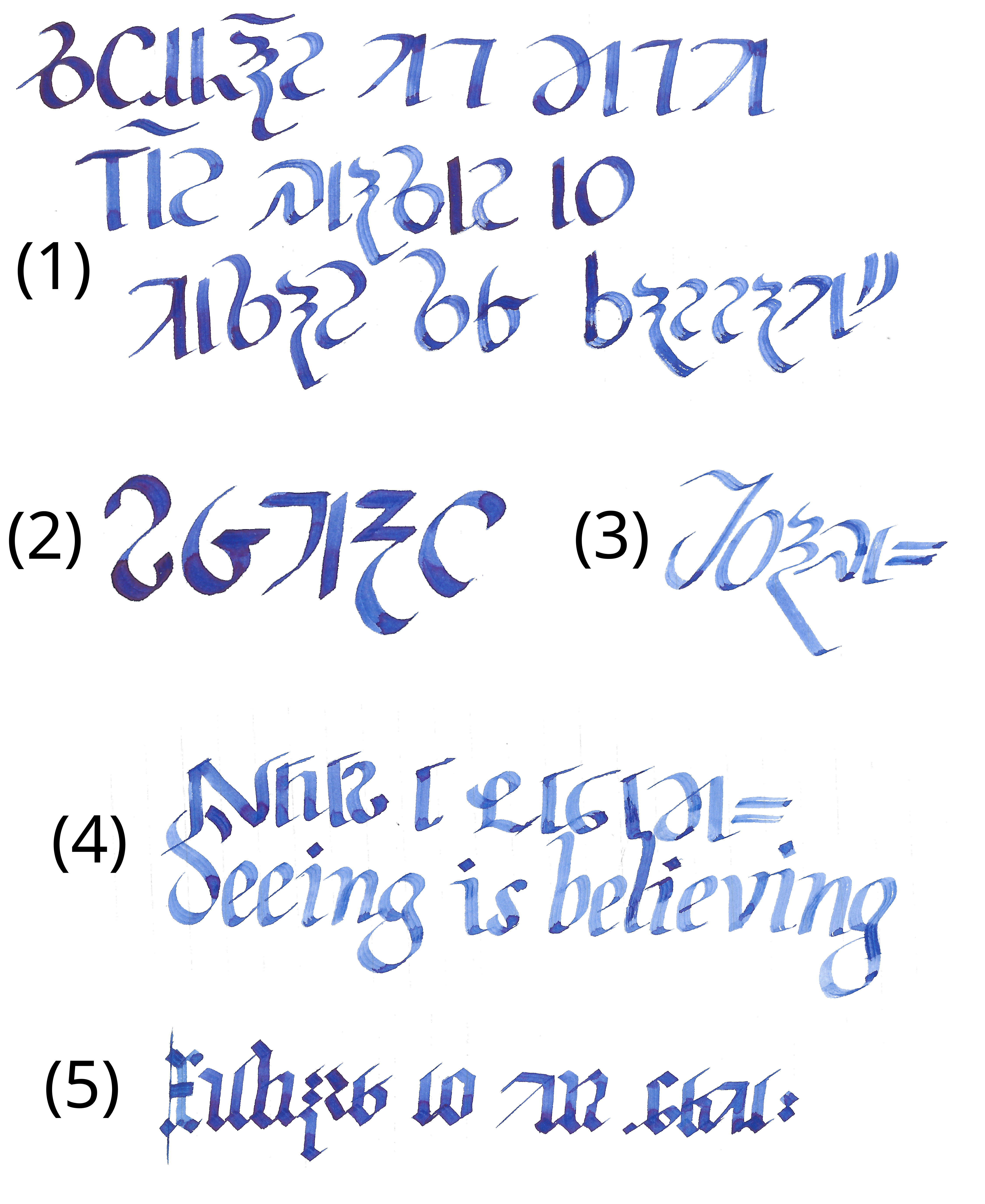
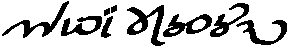
Clearly I’m not going to win any calligraphy awards any time soon. Oh well, maybe I’ll improve with practise. (For bonus points, try to find the spelling error!)
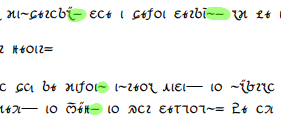
In numbered order: (1) here is an attempt at a fairly standard and formal script. The text is that on the web LCK front page, just not in cursive. (Incidentally, that’s already given me some ideas on how to simplify the letters, though none of that made it into any of these examples.) Next, (2) is an attempt at a different stress angle, which I thought came out remarkably well. (3) is more italic-inspired; it came out nice and fluid, if a bit wonky. (4) was an attempt to integrate Verdurian and English: individually, I’m happy with the results, but I’m not entirely convinced that they work together. Finally, (5) is a (somewhat inconsistent) blackletter, a style which works surprisingly well with Verdurian considering that the two are totally unrelated.
So: all in all, I’m largely happy with the results, though most of them could do with some refinement. They definitely suggest some possibilities for different Verdurian typeface styles. What does everyone else think?