Experiments in Verdurian lettering

Almea and the Incatena
bradrn
Posts: 5502
Joined: Fri Oct 19, 2018 1:25 am

Re: Experiments in Verdurian lettering

Post by bradrn »

Inspired by zompist’s recent Flaidish post:
zompist wrote: Thu Sep 21, 2023 8:31 am Liss flaid neck todde mellys churkysen yuunt gaar blaspo churket,
any flaid the.one know-ong.def good-gen evil-gen-and nature-acc if choose-part evil-def
If any flaid, knowing the nature of Good and Evil, chooses Evil,

ʔokem zeckse vott neck.
1s>3s say-ong no the.one
I have nothing to say to him.

ʔok blaste frett mellt.
1s choose-ong however good-acc
But I have chosen the Good.

phpBB unfortunately doesn't support the Verdurian alphabet.
I decided this would be a nice opportunity to try again:

Image

It’s not perfect, but what is? And I think it’s at least better than my first attempts, which is what matters.

(Pity about the misspelled word… which I’ve just noticed I got wrong both times, aaaargh…)
Conlangs: Scratchpad | Texts | antilanguage
Software: See http://bradrn.com/projects.html
Other: Ergativity for Novices

(Why does phpBB not let me add >5 links here?)
zompist
Site Admin
Posts: 2624
Joined: Sun Jul 08, 2018 5:46 am
Location: Right here, probably
Contact:

Re: Experiments in Verdurian lettering

Post by zompist »

Looks good! You're missing a couple of voicing marks (g and z), but you could add them in :)
bradrn
Posts: 5502
Joined: Fri Oct 19, 2018 1:25 am

Re: Experiments in Verdurian lettering

Post by bradrn »

zompist wrote: Tue Sep 26, 2023 12:27 am Looks good!
You're missing a couple of voicing marks (g and z), but you could add them in :)
You can see that the crossed-out word has a voicing mark on the g, but I forgot to add it when I re-wrote that work. I hadn’t noticed the mistake with z, though.
Conlangs: Scratchpad | Texts | antilanguage
Software: See http://bradrn.com/projects.html
Other: Ergativity for Novices

(Why does phpBB not let me add >5 links here?)
sasasha
Posts: 433
Joined: Mon Aug 06, 2018 11:41 am

Re: Experiments in Verdurian lettering

Post by sasasha »

I couldn't see these before, and now I can.

Very pretty! I like the way you're integrating <l> into the natural space left by surrounding letters. Different to Zomp's usual approach of elongating it, but cool too.

Something I've wondered for a long time: when Verdurians write on plain paper, do they attempt to stay in neat lines, or do they tend to adopt a slightly more integrated, fluid vertical alignment like in the old LCK sample?
zompist
Site Admin
Posts: 2624
Joined: Sun Jul 08, 2018 5:46 am
Location: Right here, probably
Contact:

Re: Experiments in Verdurian lettering

Post by zompist »

sasasha wrote: Wed Nov 08, 2023 4:46 pm Something I've wondered for a long time: when Verdurians write on plain paper, do they attempt to stay in neat lines, or do they tend to adopt a slightly more integrated, fluid vertical alignment like in the old LCK sample?
Depends on the context...

* Nice calligraphy, as in the LCK sample, is common and can said to be prototypical for handwriting. It should be free-flowing and pretty. Get a little Arabic feeling into it. This is still used for anything decorative: titles and chapter headings, logos and slogans, framed mottos, handwritten certificates, etc.
* Everyday use (your journal, class notes, a book manuscript): people value speed over beauty. Some writers are notorious for unreadability.
* An entire text, especially in pre-printing times: here scribes tried to be regular and readable. Here indeed you might pencil out guidelines. Naturally such careful texts are the model for print.

Or in short: Verdurian handwriting is more like Arabic than like Roman, but not quite like Chinese. :)
bradrn
Posts: 5502
Joined: Fri Oct 19, 2018 1:25 am

Re: Experiments in Verdurian lettering

Post by bradrn »

sasasha wrote: Wed Nov 08, 2023 4:46 pm Something I've wondered for a long time: when Verdurians write on plain paper, do they attempt to stay in neat lines, or do they tend to adopt a slightly more integrated, fluid vertical alignment like in the old LCK sample?
Ah, thanks for asking this! I wanted to ask precisely this question, but kept on forgetting…
zompist wrote: Wed Nov 08, 2023 5:17 pm Or in short: Verdurian handwriting is more like Arabic than like Roman, but not quite like Chinese. :)
And indeed, the reason I wanted to know was precisely because I did suspect it might be like Arabic! (I even mentioned Nastaʿlīq earlier in the thread.) I still have lying around on my desk a page where I tried out different possible styles for Verdurian handwriting, including Arab- and Romanesque ones, but I never found one which felt at all comfortable.

Incidentally, while I’m thinking of this: did Verdurians ever develop the flexible pointed nib? I ask because I briefly tried using it for Verdurian, and some of the letter modifications feel a lot more natural with a pointed nib than with a broad-edged nib. (In particular, the shape you use for final ⟨n⟩ always struck me as slightly odd, given that broad-edged nibs encourage pulled strokes, but with a pointed nib it just amounts to omitting the top half of the letter.)
Conlangs: Scratchpad | Texts | antilanguage
Software: See http://bradrn.com/projects.html
Other: Ergativity for Novices

(Why does phpBB not let me add >5 links here?)
sasasha
Posts: 433
Joined: Mon Aug 06, 2018 11:41 am

Re: Experiments in Verdurian lettering

Post by sasasha »

So, I'm wondering whether there might be any messy, speed-over-beauty Verdurian script examples for us to enjoy?! It's nice to get a snapshot of daily life, and not the kind of thing it's overly easy to simulate. I'd be interested to see your attempts, bradrn, and perhaps zomp has some messy pages lying around?

An analogical aside: the European Music Archaeology Project did some amazing work in the last couple of decades to reconstruct ancient instruments and get specialists to (a) work out what they were capable of doing through experimentation, and (b) try to match this with relevant description and documentation. Their findings were highly interesting - but not always entirely comfortable for listeners. Somehow identifiably more theoretical than musical.

One thing they concluded was that it's very difficult to drop an adult into a ‘world’ like this and decouple them from their own practice to ‘discover’ another without their training interfering.

So they decided the next stage was to give the instruments to a bunch of kids and try to give them something at least resembling a truly ‘classical’ music education - and started doing so. The kids (growing up in Greece) are still currently teenagers. We'll see what they come up with one day!

Perhaps we should start an Almean School to really find out what cba handwriting looks like :mrgreen:
sasasha
Posts: 433
Joined: Mon Aug 06, 2018 11:41 am

Re: Experiments in Verdurian lettering

Post by sasasha »

bradrn wrote: Wed Nov 08, 2023 8:01 pmIncidentally, while I’m thinking of this: did Verdurians ever develop the flexible pointed nib? I ask because I briefly tried using it for Verdurian, and some of the letter modifications feel a lot more natural with a pointed nib than with a broad-edged nib. (In particular, the shape you use for final ⟨n⟩ always struck me as slightly odd, given that broad-edged nibs encourage pulled strokes, but with a pointed nib it just amounts to omitting the top half of the letter.)
I have also wondered this, and glad you asked!

Whilst pointed nibs can do most things, those forms also remind me of stylus-and-tablet Latin forms, such as the style of the Vindolanda tablets. Did Eretald ever have a stylus-and-tablet phase? Or brush pens?
zompist
Site Admin
Posts: 2624
Joined: Sun Jul 08, 2018 5:46 am
Location: Right here, probably
Contact:

Re: Experiments in Verdurian lettering

Post by zompist »

bradrn wrote: Wed Nov 08, 2023 8:01 pm Incidentally, while I’m thinking of this: did Verdurians ever develop the flexible pointed nib? I ask because I briefly tried using it for Verdurian, and some of the letter modifications feel a lot more natural with a pointed nib than with a broad-edged nib. (In particular, the shape you use for final ⟨n⟩ always struck me as slightly odd, given that broad-edged nibs encourage pulled strokes, but with a pointed nib it just amounts to omitting the top half of the letter.)
I would assume so. I like scripts with more control over thick-and-thin, and back when I was playing with calligraphy I had both types.
bradrn
Posts: 5502
Joined: Fri Oct 19, 2018 1:25 am

Re: Experiments in Verdurian lettering

Post by bradrn »

sasasha wrote: Thu Nov 09, 2023 1:52 am So, I'm wondering whether there might be any messy, speed-over-beauty Verdurian script examples for us to enjoy?!
I second this request!
I'd be interested to see your attempts, bradrn
OK, I’ll post a scan later tonight [EDIT: tomorrow].
An analogical aside: the European Music Archaeology Project did some amazing work in the last couple of decades to reconstruct ancient instruments and get specialists to (a) work out what they were capable of doing through experimentation, and (b) try to match this with relevant description and documentation. Their findings were highly interesting - but not always entirely comfortable for listeners. Somehow identifiably more theoretical than musical.

One thing they concluded was that it's very difficult to drop an adult into a ‘world’ like this and decouple them from their own practice to ‘discover’ another without their training interfering.

So they decided the next stage was to give the instruments to a bunch of kids and try to give them something at least resembling a truly ‘classical’ music education - and started doing so. The kids (growing up in Greece) are still currently teenagers. We'll see what they come up with one day!
Their website declares that ‘EMAP has come to the end’, and apparently that was in 2018…
zompist wrote: Thu Nov 09, 2023 2:44 am
bradrn wrote: Wed Nov 08, 2023 8:01 pm Incidentally, while I’m thinking of this: did Verdurians ever develop the flexible pointed nib? I ask because I briefly tried using it for Verdurian, and some of the letter modifications feel a lot more natural with a pointed nib than with a broad-edged nib. (In particular, the shape you use for final ⟨n⟩ always struck me as slightly odd, given that broad-edged nibs encourage pulled strokes, but with a pointed nib it just amounts to omitting the top half of the letter.)
I would assume so. I like scripts with more control over thick-and-thin, and back when I was playing with calligraphy I had both types.
Hmm, that’s interesting… in that case, why do all the existing samples seem to be broad-nibbed? If anything, I’d imagine thick-and-thin samples would be easier to create, since IIRC you use a Wacom tablet which presumably is pressure-sensitive.

(I’d try to make some myself, but I’m really bad with pointed nibs. I swear, they must be the most finickety writing instruments known to man…)
Conlangs: Scratchpad | Texts | antilanguage
Software: See http://bradrn.com/projects.html
Other: Ergativity for Novices

(Why does phpBB not let me add >5 links here?)
bradrn
Posts: 5502
Joined: Fri Oct 19, 2018 1:25 am

Re: Experiments in Verdurian lettering

Post by bradrn »

As requested, my attempts at Verdurian handwriting:

Image

I did this a while ago, but as I recall, from top to bottom the paragraphs are as follows:
  1. Title, written carefully with a ballpoint pen
  2. Non-cursive text, written with a ballpoint pen
  3. Cursive text, using an Arabic-esque model, written with a ballpoint pen
  4. Non-cursive text, written with a round-nib fountain pen
  5. Cursive text, on the same model as (3), written with the same fountain pen as (4)
  6. Cursive text, using a more Latin-based model where letters stay on the baseline, written with the same fountain pen
I feel that none of these really worked well. On reflection, I think the main issue is consistency: I’m not entirely sure where the letters tend to be joined, nor how they should be positioned in relation to each other. This makes the attempts above look rather messy. (By contrast, Arabic letters consistently start and end at the baseline so joining can happen naturally, and almost all Latin letters can get a diagonal joining stroke.)

But now that I have more time — and since I have more calligraphic experience too — perhaps I’ll experiment a bit to see if I can figure out a style for Verdurian handwriting which feels a bit more natural.
Conlangs: Scratchpad | Texts | antilanguage
Software: See http://bradrn.com/projects.html
Other: Ergativity for Novices

(Why does phpBB not let me add >5 links here?)
zompist
Site Admin
Posts: 2624
Joined: Sun Jul 08, 2018 5:46 am
Location: Right here, probably
Contact:

Re: Experiments in Verdurian lettering

Post by zompist »

Well, I had to try it. I am out of practice and this isn't intended as "what Verdurians would write"— I'd have to think about that a good deal more. This is also my second try.

My impression was that the letters <a> and <d> are very hard to connect to the next letter... but after thinking a bit I remember that I actually did that years ago. E.g. rather than writing a final swash for <a>, you just connect to the next letter. <u> is also a problem and I don't recall what I did with that.

I'd also note that it's pretty hard to distinguish <s> and <z>. There is probably a trick for this, much as people may (or may not) take effort to distinguish between Roman <n> and <u>, or how some of us use slashes to distinguish <z> from <2>.
Attachments
zaklat-handwriting.jpg
zaklat-handwriting.jpg (153.24 KiB) Viewed 2329 times
bradrn
Posts: 5502
Joined: Fri Oct 19, 2018 1:25 am

Re: Experiments in Verdurian lettering

Post by bradrn »

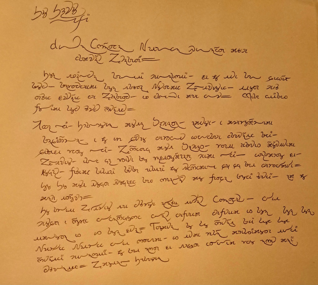
Funnily enough, that is remarkably similar to the style I just independently came up with using a broad-edged nib. I won’t scan it since I’m not convinced the ink has completely dried yet, but a photo should do as well:

Image

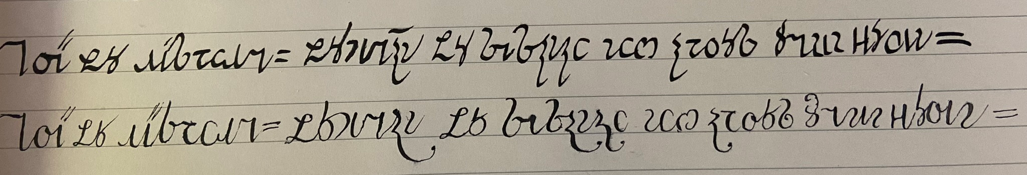
(Please excuse the lumpiness; my hands have gotten confused from switching between different styles.)

The top line is an Italic-inspired Verdurian hand with some ligatures, written using a ~1mm broad-edge nib; after some experimentation, I think this seems most comfortable for long-form writing. The bottom line is the same text rewritten with a pointed nib: like I said, I find it annoying to use, but this seems reasonably similar to zompist’s sample. (In fact I cheated a bit, since I wrote that after seeing zompist’s, but in any case it does seem like a natural development of the top line.)

So, now we have not only a sensible hand for Verdurian, but also a plausible way for it to have evolved. Cool!
zompist wrote: Fri Nov 10, 2023 12:46 am My impression was that the letters <a> and <d> are very hard to connect to the next letter... but after thinking a bit I remember that I actually did that years ago. E.g. rather than writing a final swash for <a>, you just connect to the next letter. <u> is also a problem and I don't recall what I did with that.
It’s worth noting that some 16th-century Greek manuscripts (the ‘Baroque’ group of https://spotlight.vatlib.it/greek-paleo ... tury-hands) display exactly these kinds of ligatures, and more, so this is very plausible. Admittedly, it looks like their pen is stressed in the opposite direction to that used for Verdurian (NW–SE vs NE–SW), which I imagine makes these kinds of flourishes easier for them, but for ⟨a⟩ I think it would still make sense.

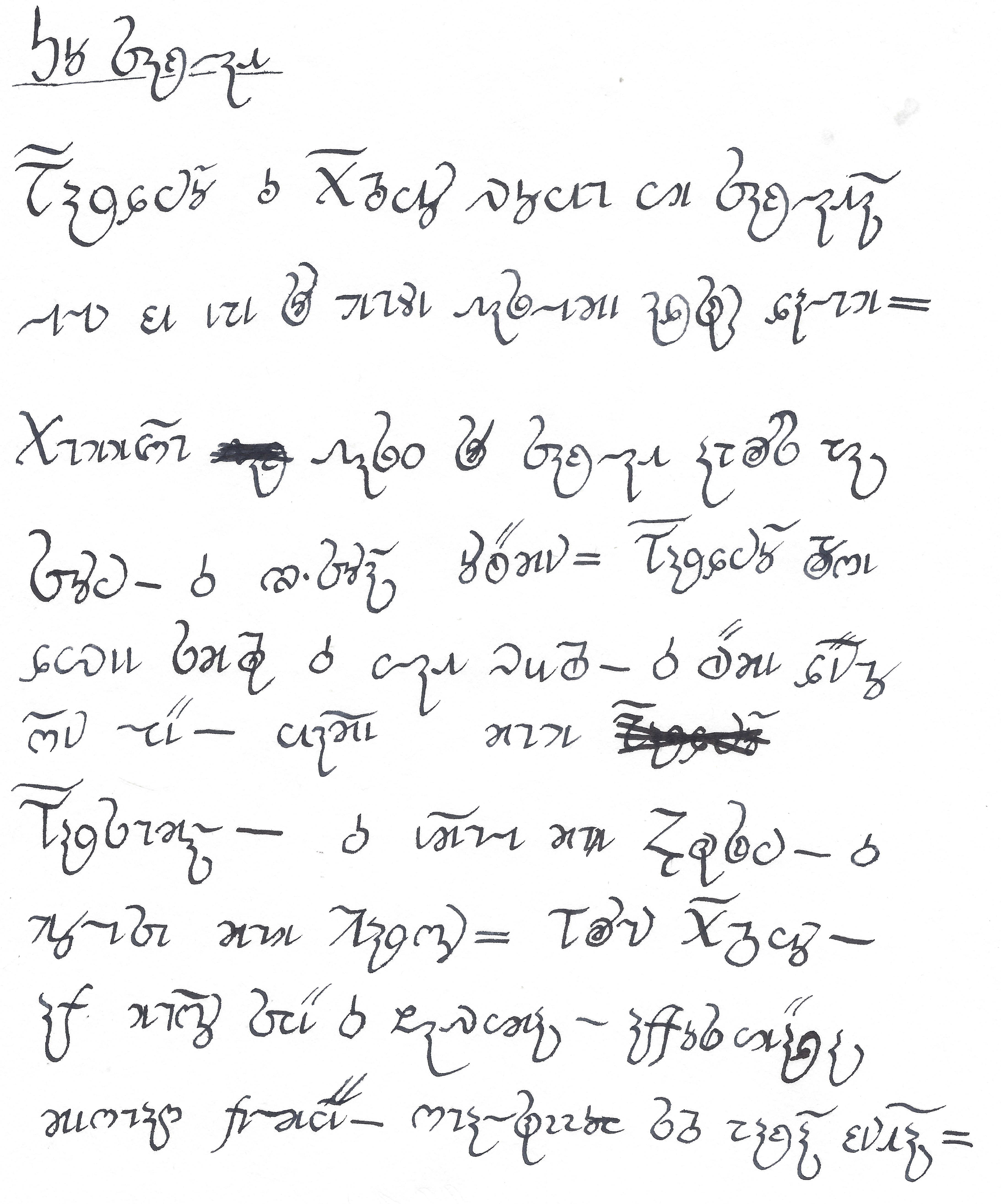
EDIT: Found another fine example of this style — the Grecs du roi typeface of the 16th century, as used e.g. in this version of the Gospel of John (Wikimedia Commons):

Image

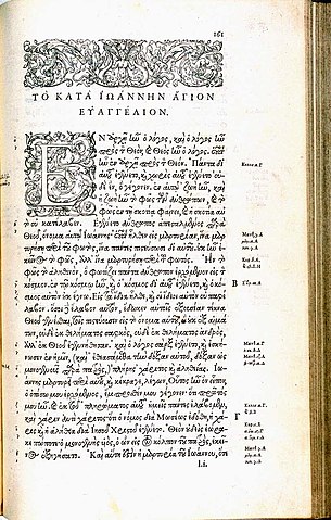
This shows many of the more bizarre ligatures of the period — I think my favourite is the ⟨ος⟩ seen in the last line, but for Verdurian the various ligatures of ⟨ϱ⟩ are probably more relevant. (It looks like there’s even a book entitled Greek ligatures in printing, specifically to aid the poor palaeographers who have to decode this stuff.)
Conlangs: Scratchpad | Texts | antilanguage
Software: See http://bradrn.com/projects.html
Other: Ergativity for Novices

(Why does phpBB not let me add >5 links here?)
User avatar
Man in Space
Posts: 1505
Joined: Sat Jul 21, 2018 1:05 am

Re: Experiments in Verdurian lettering

Post by Man in Space »

zompist wrote: Fri Nov 10, 2023 12:46 amMy impression was that the letters <a> and <d> are very hard to connect to the next letter... but after thinking a bit I remember that I actually did that years ago. E.g. rather than writing a final swash for <a>, you just connect to the next letter. <u> is also a problem and I don't recall what I did with that.
It’s entirely reasonable to have some letters that don’t ligature. Naskhi is somewhat notorious for this.
zompist wrote: Fri Nov 10, 2023 12:46 amI'd also note that it's pretty hard to distinguish <s> and <z>. There is probably a trick for this, much as people may (or may not) take effort to distinguish between Roman <n> and <u>, or how some of us use slashes to distinguish <z> from <2>.
Or, handwritten Cyrillic. All hope abandon, ye who enter there.
bradrn
Posts: 5502
Joined: Fri Oct 19, 2018 1:25 am

Re: Experiments in Verdurian lettering

Post by bradrn »

Man in Space wrote: Sat Nov 11, 2023 5:30 pm
zompist wrote: Fri Nov 10, 2023 12:46 amI'd also note that it's pretty hard to distinguish <s> and <z>. There is probably a trick for this, much as people may (or may not) take effort to distinguish between Roman <n> and <u>, or how some of us use slashes to distinguish <z> from <2>.
Or, handwritten Cyrillic. All hope abandon, ye who enter there.
Cyrillic got it from Latin. I have a penmanship book somewhere which at one point praises the handwriting of (IIRC) Queen Victoria --- but the sample it included was one in which every letter looked practically identical!
Conlangs: Scratchpad | Texts | antilanguage
Software: See http://bradrn.com/projects.html
Other: Ergativity for Novices

(Why does phpBB not let me add >5 links here?)
sasasha
Posts: 433
Joined: Mon Aug 06, 2018 11:41 am

Re: Experiments in Verdurian lettering

Post by sasasha »

Really cool to see these samples!

I had a foray into this too.

Image

The main thoughts I was pulled towards were:

- Pointing l somewhat upwards at the end made started to make sense to my own hand
- Squashing the lower part of s a bit made it flow better and distinguished it from z. (A loop on z also did the latter)
- u wanted to gravitate to the opposite of i, also like a printed n
- řo really wanted its own ligature: only the lower part of o wants to link to it
- playing with the formation of r would open up more avenues for linkage. I kept it pretty stable after I realised (from the capital form) that it was originally supposed to roll from the top to the right. But probably loosening this up makes sense.
- some letters just prefer being formed upwards, don't they. Long n and m particularly; š and ž sort of count here too. Maybe more linkage could be unlocked by more upwards-forming. Imagine if i could be formed upside-down and link straight into l
- t started to want to get very close or almost to loop, moving away from f
- I didn't know what to do with an initial n
- I bet Verdurian school kids spend years perfecting their a!
- I agree with bradrn that Greek is probably a good model. Greek handwriting isn't usually particularly joined up but uses many ligatures. That approach felt most natural to me.
bradrn
Posts: 5502
Joined: Fri Oct 19, 2018 1:25 am

Re: Experiments in Verdurian lettering

Post by bradrn »

Very, very nice! I’m not familiar enough with Verdurian to write that fluently.

Some comments:
sasasha wrote: Mon Nov 13, 2023 12:59 pm - Pointing l somewhat upwards at the end made started to make sense to my own hand
- Squashing the lower part of s a bit made it flow better and distinguished it from z. (A loop on z also did the latter)
I think these kinds of tendencies towards vaguely angular curves are mostly an artefact of using a ballpoint pen. I don’t feel these tendencies at all when using a fountain pen or any kind of calligraphic nib.

(Though then again, your ⟨l⟩ could actually work out quite well with a broad-edged nib. In my last post, I distinguished ⟨s z⟩ by linking the latter and not the former.)
- u wanted to gravitate to the opposite of i, also like a printed n
I can’t really see this anywhere in your sample.
- playing with the formation of r would open up more avenues for linkage. I kept it pretty stable after I realised (from the capital form) that it was originally supposed to roll from the top to the right. But probably loosening this up makes sense.
I never quite noticed this! But to me this opens up even more opportunities, since it means that ⟨r⟩ ends already pointing to the next letter. The Greek Bible I linked has some quite extreme ligatures with omicron I could borrow from (e.g. beginning of last line).
- some letters just prefer being formed upwards, don't they. Long n and m particularly; š and ž sort of count here too. Maybe more linkage could be unlocked by more upwards-forming. Imagine if i could be formed upside-down and link straight into l
Interesting point, and a more sensible explanation for final ⟨n⟩ than mine.
- I didn't know what to do with an initial n
Write it downwards, and link to the next letter if it can connect at the baseline? Also, I imagine ⟨no⟩ could do something similar to ⟨řo⟩. (Though it’s a hard one to link, I will admit.)
Conlangs: Scratchpad | Texts | antilanguage
Software: See http://bradrn.com/projects.html
Other: Ergativity for Novices

(Why does phpBB not let me add >5 links here?)
zompist
Site Admin
Posts: 2624
Joined: Sun Jul 08, 2018 5:46 am
Location: Right here, probably
Contact:

Re: Experiments in Verdurian lettering

Post by zompist »

sasasha wrote: Mon Nov 13, 2023 12:59 pm I had a foray into this too.
Very nice work!

You use the swash n medially, which I don't usually do, but it's totally fine.
- řo really wanted its own ligature: only the lower part of o wants to link to it
I like what you came up with. And yeah, this would be something people want to write quickly.
- playing with the formation of r would open up more avenues for linkage. I kept it pretty stable after I realised (from the capital form) that it was originally supposed to roll from the top to the right. But probably loosening this up makes sense.
That sounds backwards...?
- I bet Verdurian school kids spend years perfecting their a!
Heh! Probably... if they have graphology they would probably predict your whole personality from your a's.
bradrn
Posts: 5502
Joined: Fri Oct 19, 2018 1:25 am

Re: Experiments in Verdurian lettering

Post by bradrn »

After experimenting with ligatures for a bit, I’ve managed to make a whole bunch of weird and wonderful squiggly shapes which Verdurians could use in their writing. Alas, it’s late here and I need to sleep; I’m posting this mostly as a reminder to myself to put together something more substantive tomorrow.
Conlangs: Scratchpad | Texts | antilanguage
Software: See http://bradrn.com/projects.html
Other: Ergativity for Novices

(Why does phpBB not let me add >5 links here?)
bradrn
Posts: 5502
Joined: Fri Oct 19, 2018 1:25 am

Re: Experiments in Verdurian lettering

Post by bradrn »

This ligated style feels surprisingly easy and natural to write, though I’m interested to see whether anyone else can read it!

Image

An unexpectedly helpful side-effect is that certain letters become a lot easier to distinguish. For instance, ⟨s⟩ and ⟨z⟩ can be told apart via the location of the ligature: inside the circle for ⟨s⟩, to the right for ⟨z⟩. Similarly, ⟨t⟩ joins to the bottom-left, while ⟨e⟩ can only join at the top, if at all. Still not sure what to do about ⟨t⟩ vs ⟨f⟩, although then again they’re obviously different when written with this nib.
Conlangs: Scratchpad | Texts | antilanguage
Software: See http://bradrn.com/projects.html
Other: Ergativity for Novices

(Why does phpBB not let me add >5 links here?)
Post Reply