Page 215 of 216
Re: Conlang Random Thread
Posted: Wed Sep 23, 2026 2:56 am
by sasasha
bradrn wrote: ↑Tue Sep 22, 2026 6:43 pm
By request, my latest experiments with Eŋes script:

The page is rather disorganised, alas. On the top row we have some reasonably well-worked-out logograms. The next couple of lines try to explore the design space a little more. The lines below them look at the effect of changing how the strokes are joined (it’s rather subtle). Towards the bottom are some glyphs I was
not happy with: I decided they break the design rules, some of which I attempted to codify on the left-hand side. Scattered around the page are also some experiments with using a more vertical pen angle, more like what was used in the Nuskhuri samples I was using as inspiration. (It looks good but I find it hard to write.)
I think I have said this before, but a logographic script with this kind of aesthetic is
really cool, and I like the way you’ve built up a cohesive library of design elements and continue to develop design rules that make this distinctive.
Thinking about the discussion over on the Verdurian handwriting thread about graphemes and glyphs, I wonder if the logographic part of the Eŋes script counts features like ‘an extra wiggle’, ‘a 90° downward rotation’ and ‘a descending loop’ as
graphemes, i.e. are they in some cases meaningful elements like 口 and 女 within 如? I don’t know how you’ve built your logograms, but I can imagine this potentially being the case.
Which would give me the vocabulary to articulate what I particularly like about this: it seems to be a logographic script whose smallest meaningful elements are rather efficiently mapped to some of the smallest distinct marks that can be made with the writing implements for which it was designed. (I think that came out right.)
Chinese is the same, of course: a single ‘brush-dot’ (you know the shape I mean) can be a grapheme. And those are deeply distinctive, like Eŋes’ wiggles.
Re: Conlang Random Thread
Posted: Wed Sep 23, 2026 6:18 am
by bradrn
sasasha wrote: ↑Wed Sep 23, 2026 2:56 am
Thinking about the discussion over on the Verdurian handwriting thread about graphemes and glyphs, I wonder if the logographic part of the Eŋes script counts features like ‘an extra wiggle’, ‘a 90° downward rotation’ and ‘a descending loop’ as
graphemes, i.e. are they in some cases meaningful elements like 口 and 女 within 如? I don’t know how you’ve built your logograms, but I can imagine this potentially being the case.
Which would give me the vocabulary to articulate what I particularly like about this: it seems to be a logographic script whose smallest meaningful elements are rather efficiently mapped to some of the smallest distinct marks that can be made with the writing implements for which it was designed. (I think that came out right.)
Chinese is the same, of course: a single ‘brush-dot’ (you know the shape I mean) can be a grapheme. And those are deeply distinctive, like Eŋes’ wiggles.
Precisely! Though I feel uncomfortable with calling them ‘graphemes’ — I think of the parts as ‘strokes’, like in Chinese.
A counterpoint is Hieratic or Demotic Egyptian, which are logographic and written with the same sort of pen but
not easily subdivisible into strokes like this. The textbooks I’ve seen for those scripts emphasise that the only way to identify their glyphs is to look at them holistically.
Re: Conlang Random Thread
Posted: Wed Sep 23, 2026 1:52 pm
by Leilis
That is lovely and you have inspired me to work on Heláin script! I don't know how best to insert the image here, so I've linked to it
in my Heláin thread.
Re: Conlang Random Thread
Posted: Wed Sep 23, 2026 2:50 pm
by jal
I also love the aesthetics of the script, though I'm wondering if it could come about naturally. In which I mean that logographic scripts start out with, well, logos, recognizable pictures. Over time they become abstract (as we've seen with cuneiform, Chinese and Egyptian), but they then lose most of the recognizable elements. So it would be hard to naturally evolve a logographic script that is abstracted/simplified but still retains distinct, recognizable elements that carry meaning.
JAL
Re: Conlang Random Thread
Posted: Wed Sep 23, 2026 3:28 pm
by malloc
jal wrote: ↑Wed Sep 23, 2026 2:50 pmI also love the aesthetics of the script, though I'm wondering if it could come about naturally. In which I mean that logographic scripts start out with, well, logos, recognizable pictures. Over time they become abstract (as we've seen with cuneiform, Chinese and Egyptian), but they then lose most of the recognizable elements. So it would be hard to naturally evolve a logographic script that is abstracted/simplified but still retains distinct, recognizable elements that carry meaning.
Perhaps so, although the extent to which logographic characters resemble their referents varies considerably with script and I suspect it depends on your familiarity with their etymology as well. Nothing about the 虫 character obviously signifies its relation to insects or even pictographic origins after all.
Re: Conlang Random Thread
Posted: Wed Sep 23, 2026 4:54 pm
by bradrn
jal wrote: ↑Wed Sep 23, 2026 2:50 pm
I also love the aesthetics of the script, though I'm wondering if it could come about naturally. In which I mean that logographic scripts start out with, well, logos, recognizable pictures. Over time they become abstract (as we've seen with cuneiform, Chinese and Egyptian), but they then lose most of the recognizable elements. So it would be hard to naturally evolve a logographic script that is abstracted/simplified but still retains distinct, recognizable elements that carry meaning.
Indeed. I don’t think this script
has really ‘distinct, recognizable elements that carry meaning’, any more than Chinese does. (Of course, Chinese characters have their radicals, and this script will likewise have its radical-equivalents.) At the moment I’m concentrating almost entirely on its visual aspects.
Re: Conlang Random Thread
Posted: Thu Sep 24, 2026 11:46 am
by rotting bones
Are we all doing scripts? Here's the original Laulai script:

I think I was going for a flickering flames vibe. It probably didn't come across at all. I don't have the inspiration to redo it right now, so any advice is appreciated.
Re: Conlang Random Thread
Posted: Thu Sep 24, 2026 12:26 pm
by /ˌnɐˈɾɛndɚduːd/
I used to be big into what I would've called 'script-making' but was probably more akin to cipher-making back before I started to get into conlanging. I'd show some of them here but unfortunately I was more sporadic back then with projects than I am now, so most of them are completely unfinished and all of them are poor in quality. the most recent thing that I can reliably call a 'script' that I've made is for a conlang called Vaklis that I started and dropped during the summer months.
Re: Conlang Random Thread
Posted: Thu Sep 24, 2026 12:31 pm
by /ˌnɐˈɾɛndɚduːd/
rotting bones wrote: ↑Thu Sep 24, 2026 11:46 am
Are we all doing scripts? Here's the original Laulai script:
I think I was going for a flickering flames vibe. It probably didn't come across at all. I don't have the inspiration to redo it right now, so any advice is appreciated.
I quite like the vibe this script gives, actually! I wouldn't say it comes across as flame-looking, but it is certainly not harsh to look at.
Re: Conlang Random Thread
Posted: Thu Sep 24, 2026 12:37 pm
by rotting bones
/ˌnɐˈɾɛndɚduːd/ wrote: ↑Thu Sep 24, 2026 12:31 pm
rotting bones wrote: ↑Thu Sep 24, 2026 11:46 am
Are we all doing scripts? Here's the original Laulai script:
I think I was going for a flickering flames vibe. It probably didn't come across at all. I don't have the inspiration to redo it right now, so any advice is appreciated.
I quite like the vibe this script gives, actually! I wouldn't say it comes across as flame-looking, but it is certainly not harsh to look at.
Thanks. I was thinking of Glagolitic. Some letters are Greek (m), some are ultra-cursive Greek derivatives (θ), and some are unique.
Re: Conlang Random Thread
Posted: Thu Sep 24, 2026 1:26 pm
by bradrn
Along the lines of the ongoing discussion I’ve been having with sasasha, I struggle to see how a script looking like that could have evolved using any writing implement other than a ball-point pen. (Mind you, I guess a flexible metal nib could also work, but those are relatively new too.) I suggest trying a few different styles — not least because playing around with scripts is great fun.
Re: Conlang Random Thread
Posted: Thu Sep 24, 2026 1:43 pm
by rotting bones
bradrn wrote: ↑Thu Sep 24, 2026 1:26 pm
Along the lines of the ongoing discussion I’ve been having with sasasha, I struggle to see how a script looking like that could have evolved using any writing implement other than a ball-point pen. (Mind you, I guess a flexible metal nib could also work, but those are relatively new too.) I suggest trying a few different styles — not least because playing around with scripts is great fun.
Thanks. The letters have an inscription form I'm even less satisfied with. Here's a rough copy showing what they look like:

These are not constrained by minimalism since monumental artisans have more time to get them right.
Re: Conlang Random Thread
Posted: Thu Sep 24, 2026 1:46 pm
by bradrn
rotting bones wrote: ↑Thu Sep 24, 2026 1:43 pm
These are not constrained by minimalism since monumental artisans have more time to get them right.
I’d say these forms look rather more minimalistic than the ones you gave earlier.
Re: Conlang Random Thread
Posted: Thu Sep 24, 2026 1:49 pm
by rotting bones
bradrn wrote: ↑Thu Sep 24, 2026 1:46 pm
rotting bones wrote: ↑Thu Sep 24, 2026 1:43 pm
These are not constrained by minimalism since monumental artisans have more time to get them right.
I’d say these forms look rather more minimalistic than the ones you gave earlier.
Ð has 6 (or 8) strokes in the inscription form. 2 in the cursive form.
Re: Conlang Random Thread
Posted: Fri Sep 25, 2026 5:18 am
by Qwynegold
bradrn wrote: ↑Tue Sep 22, 2026 6:43 pm
By request, my latest experiments with Eŋes script:
This looks really nice! It reminds me of medieval calligraphy, Hebrew script and Armenian. I would never have guessed that it's a logography.
Re: Conlang Random Thread
Posted: Fri Sep 25, 2026 5:27 am
by Qwynegold
rotting bones wrote: ↑Thu Sep 24, 2026 11:46 am
Are we all doing scripts? Here's the original Laulai script:
I think I was going for a flickering flames vibe. It probably didn't come across at all. I don't have the inspiration to redo it right now, so any advice is appreciated.
After you mentioned flickering flames, I see what you mean. It's the rounded leaning shapes.
If I may offer a little bit of criticism, I think the t, d and p characters look out of place in the running text; like mIscAPitaLizaTioN. Maybe it would help if the upper arm of t and d were smaller, and the p more leaning.
Re: Conlang Random Thread
Posted: Fri Sep 25, 2026 11:19 am
by rotting bones
Qwynegold wrote: ↑Fri Sep 25, 2026 5:27 am
rotting bones wrote: ↑Thu Sep 24, 2026 11:46 am
Are we all doing scripts? Here's the original Laulai script:
I think I was going for a flickering flames vibe. It probably didn't come across at all. I don't have the inspiration to redo it right now, so any advice is appreciated.
After you mentioned flickering flames, I see what you mean. It's the rounded leaning shapes.
If I may offer a little bit of criticism, I think the t, d and p characters look out of place in the running text; like mIscAPitaLizaTioN. Maybe it would help if the upper arm of t and d were smaller, and the p more leaning.
Thanks. If I'm making drastic changes, maybe I should switch š and z:

Just trying something out. Maybe I'll eventually think of a way to give the two short vertical lines a phonetic meaning.
Re: Conlang Random Thread
Posted: Sat Sep 26, 2026 5:39 pm
by sasasha
rotting bones wrote: ↑Thu Sep 24, 2026 11:46 am
Are we all doing scripts? Here's the original Laulai script:
I think I was going for a flickering flames vibe. It probably didn't come across at all. I don't have the inspiration to redo it right now, so any advice is appreciated.
I’m pretty into this, and the other Laulai examples you’ve shared.
I do think there are a bunch of writing implements that would manage something like this beyond those bradrn mentioned: pencils, styluses in wax(?) or perhaps, depending on the leaf, on leaves... And perhaps this form of Laulai is written with flexible metal nibs or ballpoint pens, after all. Just because this version has been shared, it doesn’t mean there isn’t a stylistic development implied as existing over time to this point and supported by technical development.
But I agree with bradrn that you could experiment with different styles. Specifically, maybe try different approaches to letter joining and overall character alignment (which is currently quite ‘italic’, FWOABW). You wanted a flickering flames vibe: maybe characters don’t have to join as often, or join differently, and then you might be able to achieve some more heliacal shapes that might look even more like flames? I particularly like that some letters are multi-part and require two strokes: if a single letter can be like this, perhaps some letters don’t need to join, either?
Edit 3: what about separate word initial forms that don’t have to include a joining stroke on the left hand side?
Was there a cultural (or other) reason behind choosing the flames vibe, out of interest?
Two elements of the inscription form strike me as a bit unlikely: the consecutive short vertical dashes and the elements that resemble <>. They’re both quite small details that seem unlikely to scale well as they are. The dashes I would be tempted to rotate individually so they are both diagonal and thus not sitting end-to-end. The <>s... The one on ⟨R⟩ doesn’t bother me, but those on ⟨B⟩ and ⟨Ð⟩ seem too busy and fiddly. I personally feel the mark that distinguishes ⟨S T⟩ from ⟨Š Č⟩ and ⟨P D⟩ from ⟨B Ð⟩ might as well be the same, and, whilst I hear your comment that this script can be pretty ornamental due to, let’s call them, “socioscriptorial factors”, probably could be simplified. Otherwise I really like this.
Edit: I realise I didn’t pick on ⟨K G⟩ in the same way; oddly I like ⟨G⟩, to me the glyph the modifier sits on is simpler and more harmonious to the modifier itself. Something to ponder.
Re the cursive version again, I’m not personally bothered by the multi-height vibe. I think it could be a feature. At the moment your example looks quite inspired by cursive Latin and Cyrillic hands; the overall resemblance is quite strong due to the joining strategies and italic-like alignment, thus the vertical variance is potentially a bit jarring in being the only particularly ‘non-Western’-looking element. If you reduced this resemblance a little, the multi-height thing might not stick out so much.
Just a couple of ideas, again.
Edit 2: I agree with Qwynegold about the leaning ⟨p⟩.
Re: Conlang Random Thread
Posted: Sun Oct 04, 2026 5:15 pm
by sasasha
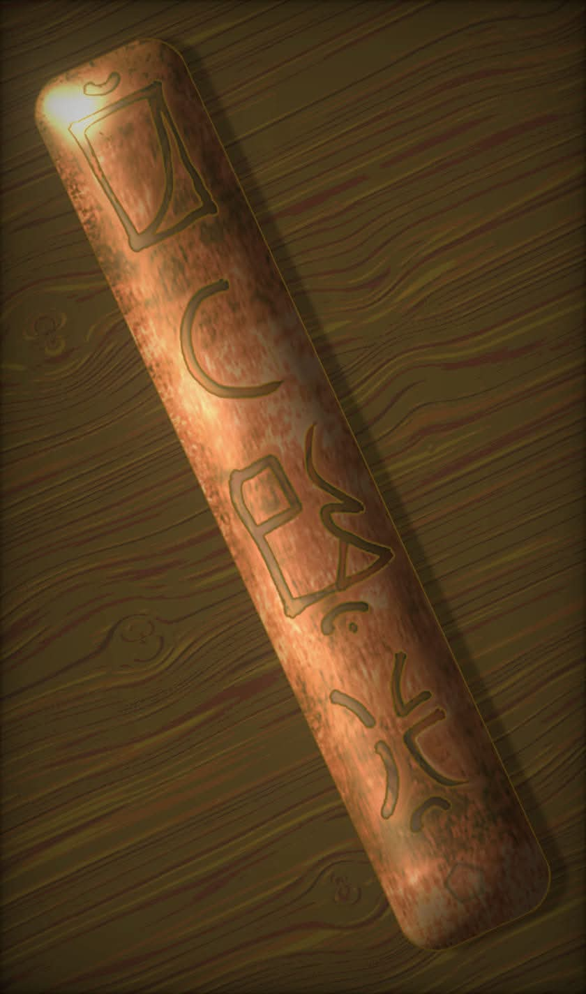
- FB_IMG_1790460236217.jpg (64.05 KiB) Viewed 1356 times
A taster, because I can’t find the full documentation. A conscript involving CVC blocks, consisting of mirrored consonant elements (i.e. the coda form is a mirror image of the onset form) and diacritics for vowels. This example says
kip at djom suz ‘book of the ways to adorn sound’ ‒ a grammar book, I guess. Or music! The idea is that this is a metal plaque, probably bronze, that goes at either end of a book made of a concertina of paper. You can see that the VC string
at has a curve open to the right;
ta would face left. I will try to find the full script...
Re: Conlang Random Thread
Posted: Mon Oct 05, 2026 3:48 am
by hwhatting
I'm always in awe when people make artifacts belonging to a con-culture (same with your Almean music). I simply don't have the abilities to do that.