What fonts do you use on a daily basis? How have they evolved over time?
In my browser, I use Roboto, Roboto Slab, and Robot Mono for sans-serif, serif, and monospace fonts respectively. I like the Roboto family because the letter forms are narrower than other fonts. Years ago, when I was still using Windows 7, my default fonts were Segoe UI, Cambria, and Consolas. Before that, when I was still using Window XP, my default fonts were Trebuchet MS, Times New Roman, and Courier New.
Besides these fonts, I sometimes use Impact (or Anton, which is a free clone of Impact) if I need to make a meme.
What fonts do you use?

Re: What fonts do you use?
In most cases in google docs i use Arial. To do something different i just use Italics.
Re: What fonts do you use?
I use a wide range of typefaces (not fonts!), depending on what I need. Some of the ones I’ve used recently:
- Since I use LaTeX extensively, the default tends to be Computer Modern, or its updated clone Latin Modern.
- Palatino is a nice all-rounder. For my thesis I’m using Palatino, with math in AMS Euler. (Both are by Hermann Zapf, so they work well together.)
- I feel Optima (again by Zapf) also works well with Palatino as a sans-serif, though usually I only use it at larger sizes so its subtlety doesn’t get lost.
- For conlanging, I tend to set things in Linux Libertine (another all-rounder), Brill, Junicode, or another face with good Unicode support. When working on the reconstruction relay with Darren and foxcatdog, I settled on Tinos for the grammar in Google Docs (with Arimo for headings).
- My website uses Source Sans, another one chosen for its Unicode support — but I’m not sure I love it as a typeface. The logo uses AB Bakul for Javanese.
- For scientific posters, I tend to set the body text in Myriad, which is particularly legible from a distance. For headings, I haven’t made enough posters to have settled on one typeface (if indeed I ever do)… but I tried Klavika for the last one, which I thought worked well.
- For programming and text editing I just use Consolas. I’ve tried others, but I’ve yet to find anything to match it. When Consolas isn’t available, I use Ubuntu Mono.
Conlangs: Scratchpad | Texts | antilanguage
Software: See http://bradrn.com/projects.html
Other: Ergativity for Novices
(Why does phpBB not let me add >5 links here?)
Software: See http://bradrn.com/projects.html
Other: Ergativity for Novices
(Why does phpBB not let me add >5 links here?)
-
Man in Space

- Posts: 1554
- Joined: Sat Jul 21, 2018 1:05 am

Re: What fonts do you use?
I like Roboto Slab for reading. In my conlang docs, I use Andika or Charis SIL.
-
Moose-tache
- Posts: 1746
- Joined: Fri Aug 24, 2018 2:12 am
Re: What fonts do you use?
I like the antique Gaudi/Bookman/Hightower typefaces. It's very Dark Academia, even though it's a little cheesy.
For actual publications, I use Georgia, since it's extremely readable on a tablet.
For actual publications, I use Georgia, since it's extremely readable on a tablet.
I did it. I made the world's worst book review blog.
Re: What fonts do you use?
Those are three completely different styles of typeface (assuming by Gaudi you mean this thing).
EDIT: On reflection, did you mean Goudy Old Style? That would make more sense, since it’s similar to Hightower (if not Bookman).
Conlangs: Scratchpad | Texts | antilanguage
Software: See http://bradrn.com/projects.html
Other: Ergativity for Novices
(Why does phpBB not let me add >5 links here?)
Software: See http://bradrn.com/projects.html
Other: Ergativity for Novices
(Why does phpBB not let me add >5 links here?)

Re: What fonts do you use?
I use a default sans serif font, a serif font and a fixed-width font,
depending on whether my PC is pro windows or perso linux...
and of course my special font for 3SDL...
depending on whether my PC is pro windows or perso linux...
and of course my special font for 3SDL...

Re: What fonts do you use?
I admit that I'm pretty boring in that regard. I use whatever I'm given as the default. If I should ever find myself in a situation where the default is something I see as stupid or embarrassing, I might change that approach, but so far, that hasn't happened yet.
Re: What fonts do you use?
i quite like having each document in its own font or combo of fonts. just like making them different colours, it helps with remembering what they're about, to sort of make a mental place for each thing. the conlang in currently playing around with is going to be in Raleway, i think.
Re: What fonts do you use?
Yes, I knew that the proper term was "typeface", but I forgot, and I'm not sure why... Oh well !I use a wide range of typefaces (not fonts!), depending on what I need. Some of the ones I’ve used recently:
Now that you mentioned Georgia, I think I got my fonts timeline a little mixed up. I used Georgia for a while as my serif font with Segoe UI as my sans serif font. So my timeline was actually something more like this:For actual publications, I use Georgia, since it's extremely readable on a tablet.
Win 10 : Roboto, Roboto Slab, Roboto Mono
Win 7 : Segoe UI, Georgia, Consolas
Win XP : Trebuchet MS, Cambria, Courier New
Win ME : Arial, Times New Roman, Courier New
I like Georgia's letters, but I don't like how some of its numbers go below the baseline, and some don't go above the cap line. I understand that it's supposed to make it feel old/classic, but imo it just destroys the readability and uniformity, which is too much for me.

More honorable mentions:
Courier Prime : A free alternative to Courier New. ( https://fonts.google.com/specimen/Courier+Prime )
Shin Go : It looks nice and is readable, so I keep telling myself that I'll use it for something one day, but I haven't yet. ( https://fontsgeek.com/fonts/a-otf-shin-go-pro-b )
What about when you have to write a paper and the teacher/journal demands it be written in Times New Roman, even though it's not going to be printed on newspaper or a travel-size paperback novel?I admit that I'm pretty boring in that regard. I use whatever I'm given as the default. If I should ever find myself in a situation where the default is something I see as stupid or embarrassing, I might change that approach, but so far, that hasn't happened yet.
Re: What fonts do you use?
That’s not really their purpose. (Well, not just that.) The idea behind these ‘text’ figures is simply that they fit in with the lowercase letters better — lowercase letters have ascenders and descenders, and so should the numbers. They work best when your document has few numbers in it, and those which are present are used together with text. On the other hand, if you’re writing something more technical, they don’t work nearly so well.jcb wrote: ↑Sun Oct 01, 2023 2:15 am I like Georgia's letters, but I don't like how some of its numbers go below the baseline, and some don't go above the cap line. I understand that it's supposed to make it feel old/classic, but imo it just destroys the readability and uniformity, which is too much for me.
Conlangs: Scratchpad | Texts | antilanguage
Software: See http://bradrn.com/projects.html
Other: Ergativity for Novices
(Why does phpBB not let me add >5 links here?)
Software: See http://bradrn.com/projects.html
Other: Ergativity for Novices
(Why does phpBB not let me add >5 links here?)

Re: What fonts do you use?
When I'm doing something purely for personal use, I like Alegreya. (It has a sans-serif counterpart, but I generally prefer serif fonts.) When I'm doing something that requires phonetic notation, I use Gentium Plus. For programming I've been using Iosevka for a while now—other monospace fonts are too wide for me. (I used Iosevka Aile for a while; I liked it a lot but couldn't stick with it because proportional fonts break stuff indented with spaces.) I also have Cabin installed for use with OpenTTD—it makes sense to me to use a font inspired by things like Johnston Sans in a game about trains.
Re: What fonts do you use?
I second these choices — they’re all really lovely fonts. Alegreya in particular is one of the best free fonts around. However, I find Alegreya and Gentium to have just slightly too much character for my own tastes.Ketsuban wrote: ↑Sun Oct 01, 2023 7:22 am When I'm doing something purely for personal use, I like Alegreya. (It has a sans-serif counterpart, but I generally prefer serif fonts.) When I'm doing something that requires phonetic notation, I use Gentium Plus. For programming I've been using Iosevka for a while now—other monospace fonts are too wide for me. (I used Iosevka Aile for a while; I liked it a lot but couldn't stick with it because proportional fonts break stuff indented with spaces.) I also have Cabin installed for use with OpenTTD—it makes sense to me to use a font inspired by things like Johnston Sans in a game about trains.
Conlangs: Scratchpad | Texts | antilanguage
Software: See http://bradrn.com/projects.html
Other: Ergativity for Novices
(Why does phpBB not let me add >5 links here?)
Software: See http://bradrn.com/projects.html
Other: Ergativity for Novices
(Why does phpBB not let me add >5 links here?)

Re: What fonts do you use?
Comic Sans and Palace Script. All others are abominations unto the LORD.
Self-referential signatures are for people too boring to come up with more interesting alternatives.
Re: What fonts do you use?
Oh really ? ... I still don't like it; The numbers just look wrong.bradrn wrote: ↑Sun Oct 01, 2023 3:17 amThat’s not really their purpose. (Well, not just that.) The idea behind these ‘text’ figures is simply that they fit in with the lowercase letters better — lowercase letters have ascenders and descenders, and so should the numbers. They work best when your document has few numbers in it, and those which are present are used together with text. On the other hand, if you’re writing something more technical, they don’t work nearly so well.jcb wrote: ↑Sun Oct 01, 2023 2:15 am I like Georgia's letters, but I don't like how some of its numbers go below the baseline, and some don't go above the cap line. I understand that it's supposed to make it feel old/classic, but imo it just destroys the readability and uniformity, which is too much for me.
Apparently, there's also a "Alegreya Sans" font that has a bit less "character" than straight "Alegreya": https://fonts.google.com/specimen/Alegr ... uery=alegrI second these choices — they’re all really lovely fonts. Alegreya in particular is one of the best free fonts around. However, I find Alegreya and Gentium to have just slightly too much character for my own tastes.
No Papyrus ? (Although, even Avatar has abandoned Papyrus for a new font now: https://www.creativebloq.com/news/avata ... water-logo )Comic Sans and Palace Script. All others are abominations unto the LORD.
Re: What fonts do you use?
I feel it’s best illustrated in an actual example of usage. Here’s some text from https://en.wikipedia.org/w/index.php?ti ... 1178359511, set in Palatino with text figures:jcb wrote: ↑Thu Oct 05, 2023 12:06 amOh really ? ... I still don't like it; The numbers just look wrong.bradrn wrote: ↑Sun Oct 01, 2023 3:17 amThat’s not really their purpose. (Well, not just that.) The idea behind these ‘text’ figures is simply that they fit in with the lowercase letters better — lowercase letters have ascenders and descenders, and so should the numbers. They work best when your document has few numbers in it, and those which are present are used together with text. On the other hand, if you’re writing something more technical, they don’t work nearly so well.jcb wrote: ↑Sun Oct 01, 2023 2:15 am I like Georgia's letters, but I don't like how some of its numbers go below the baseline, and some don't go above the cap line. I understand that it's supposed to make it feel old/classic, but imo it just destroys the readability and uniformity, which is too much for me.
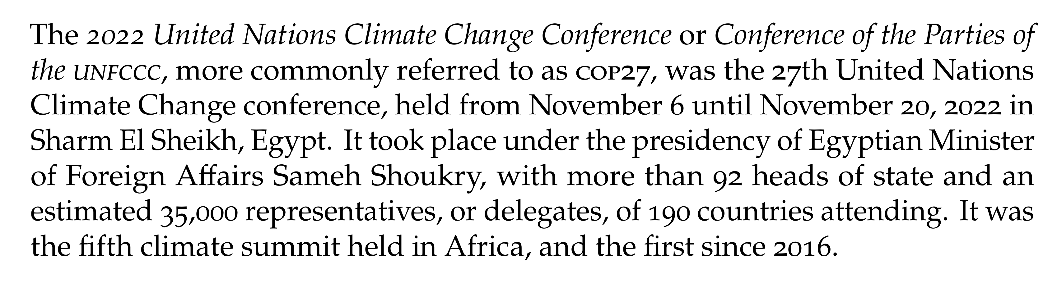
At least to me, the numbers blend in very well with the text here. In particular, I consider them mandatory when used with the small caps: full-sized figures would look really weird there. (If Unicode small caps render for you, it would look like ᴄᴏᴘ27 — the text and numbers are mismatched in size.)
Indeed, but I often want a serif font. Besides, the whole appeal of Alegreya is that it is a bit quirky.Apparently, there's also a "Alegreya Sans" font that has a bit less "character" than straight "Alegreya": https://fonts.google.com/specimen/Alegr ... uery=alegrI second these choices — they’re all really lovely fonts. Alegreya in particular is one of the best free fonts around. However, I find Alegreya and Gentium to have just slightly too much character for my own tastes.
Conlangs: Scratchpad | Texts | antilanguage
Software: See http://bradrn.com/projects.html
Other: Ergativity for Novices
(Why does phpBB not let me add >5 links here?)
Software: See http://bradrn.com/projects.html
Other: Ergativity for Novices
(Why does phpBB not let me add >5 links here?)
-
Moose-tache
- Posts: 1746
- Joined: Fri Aug 24, 2018 2:12 am
Re: What fonts do you use?
Yeah, on a superficial level. But I mean I like Old Style typefaces, i.e. the ones created to emulate various early modern printers.
I did it. I made the world's worst book review blog.